Posts

Showing posts from September, 2021

Data Ink Ratio

Image
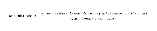
Imagine this. You are in a meeting and someone is presenting a chart to the group. You look at the chart and try to grasp the information. But there are several elements on the chart distracting you to consume the information right away. You ask yourself, are all the elements on this chart necessary? Can some elements be removed without taking away the core information from this chart? Is there any guideline or principle that can be applied to make this chart more consumable?   Well you are in luck. There is a principle created just to achieve this and it's called  Data Ink Ratio . It was introduced by Edward Tufte who is considered one of the major figures in the field of data visualization. Tufte argues that a chart should only contain those elements which if removed, the chart will lose it's core information. Data Ink Ratio can be calculated as:- Let look at an example. Below is a chart with low data ink ratio . When you carefully examine the chart, you can find some eleme

8-bit Gaming

Image
Third generation video game consoles (read NES and SEGA-GENESIS) will always hold a special place in my heart. I have spend countless hours playing these gems. From running my bike on custom designed tracks in ExciteBike to teaming up with my friends in Contra to save the world, every single moment is a  pleasant memory I still cherish to this day. While going through kaggle I found video game sales data for games by different platforms. I decided to extract and visualize NES games from this data set. Here's what I came up with Link to interactive version Tools Used:- Data Preparation - SQL Data Visualization - Tableau

Spread of Memonavirus

Image
  Memonavirus  is a fictional virus that was created on reddit that mimic the spread of pandemic in real world. Rule for memonavirus outbreak was simple - a patient zero is infected with the virus.   Commenting under a user who is infected get's you infected and commenting on a post that is infected will infect you with a 1% chance. You can read more about the virus here . r/dataisbeautiful is a community on reddit dedicated to data visualization. They hosted data viz battle to visualize spread of memonavirus. My entry won 2nd place in the battle. Link to interactive version Tools used:- Data Preparation - SQL Data Visualization - Tableau