Posts

A Toast to Wine Tasting Event

Image
Welcome to wine tasting event dashboard! This interactive tool allows you to track the performance of tasters as they identify the grape and country of origin for each wine. With a scoring system that awards points for correct and partially correct answers, you can see how each taster fares in their knowledge of red and white wines. The dashboard is easy to use, with the ability to sort by Overall Score, Red Score, or White Score, and includes images in the table headings related to the Score Type. Join us as we explore the world of wine through the eyes of wine tasters! 🍷 Interactive version Tool Used:- Tableau
The power of your passport

Image
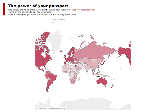
 For makeover Monday I created this visualization to showcase how passports for different countries are ranked. Developed countries with better GDP enjoy more visa free destinations than other countries. One might say there is a positive correlation between countries’ GDP and number of visa free destinations. Singapore ranks #1 with Japan coming at #2, while Afghanistan and Syria rank at bottom. Interactive Version Tool Used: Tableau

Which of my products returned max and min sales?

Image
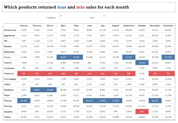
 This crosstab visualization provides details on most in demand product and least sold product for each month. User can use this information to detect a pattern and better plan their inventory. Use category and year filter to further drill down on chart. Interactive Version Tool Used:- Tableau

Cereal Production Around the World – Africa’s Hunger Crisis

Image
 This dashboard shows uneven distribution of cereal production across the globe. Despite of green revolution launched half a century ago to maximize cereal production, most of the African states are still struggling to keep a balance between their population and cereal production which ultimately results in malnutrition of the population. Follow the link below the image for interactive viz.   Interactive Version Tool Used: Tableau

Melbourne Pedestrian Counting System

Image
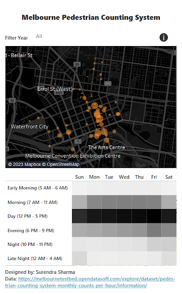
Created this mobile friendly dashboard to track Pedestrian Patterns for Melbourne city. The city has sensors placed at major spots to track pedestrian foot traffic. Original tracking system can be found at http://www.pedestrian.melbourne.vic.gov.au/ . This dashboard is a makeover for the original system to better track pedestrian patterns. Using this information city administration can get information on different areas and rush at period of day. This information can be used for better city planning such as diverting traffic or deciding working hours for maintenance work. Interactive Version Tool Used: Tableau

Heads or Tails

Image
Build a viz showing what percentage of matches are won by a team after winning the toss. It basically tells if winning a toss have any crucial impact on the match result. What I can see from viz is that it does have some affect on the outcome but nothing significant. In the end, how team plays on the field is all that matters. Interactive Link Tool Used:- Tableau

Superstore Executive Dashboard

Image
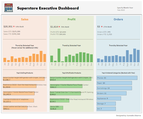
Here's my take on executive type dashboard built on superstore data. The major learning from this dashboard was using layout containers inside tableau to neatly organize dashboard items. Layout containers let you group related items together so you can quickly position them. Once items are inside the containers, you can change the size and placement of items inside a container and other items automatically adjust. There are two types of containers - vertical and horizontal. As name suggests, horizontal containers places items left/right and vertical containers places items above/below. It’s always a good idea to use containers for your production dashboards as this will greatly help you organize and standardize the size and layout of your dashboard’s worksheets.   Interactive Version Tool Used:- Tableau