Posts

Showing posts with the label Power BI

McHealthy

Image
  Ever wondered what is the most healthy dish on McDonalds India menu. This visualization helps you quickly choose a healthy item based on factors like total sugar, total fat and cholesterol. Read text on visualization to know more. Click on image to enlarge

Movie-Lookup

Image
Ever wonder which movie should I watch this weekend?  You login to your favorite streaming service just to find yourself struck in vicious loop of  checking it's rating on IMDB and then searching for some more before deciding on that one movie which you might find interesting. I thought wouldn't it be great to have a dashboard with movies rated and you can apply some criteria to find what movie you are looking for. I searched for IMDB data and found it on kaggle website. This data is used to create and train recommendation systems, but for me a simple dashboard was enough to find movies I might enjoy on my weekend.  

Choked

Image
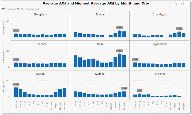
 India has 9 of the 10 most polluted cities in the world.  As per a study based on 2016 data, at least 140 million people in India breathe air that is 10 times or more over the WHO safe limit. Air pollution contributes to the premature deaths of 2 million Indians every year.  Emissions come from vehicles and industry, whereas in rural areas, much of the pollution stems from biomass burning for cooking and keeping warm. In autumn and spring months, large scale crop residue burning in agriculture fields – a cheaper alternative to mechanical tilling – is a major source of smoke, smog and particulate pollution. Click on graph below which shows monthly average Air Quality Index (AQI) across various Indian cities from 2015 - 2020. It also shows month with highest average AQI for that city. Tool Used:- Power BI Data:- kaggle.com

India's Inflation Rate

Image
 Rise in price of essential commodities have hit common people in India as inflation rate skyrocketed in recent times. Rise in fuel prices and their ripple effects on transport and logistics costs are expected to intensify the issue. If you wondered what historical inflation rate in India looked, here's a quick summary

Time flies

Image
 Time is an amazing thing. On a clock it's a steady and measurable phenomenon. But in mind it depends on different factors. According to some researchers your perception of time can depend on factors such as your age, activities you are involved in or even your mood. There are some days when you look back and wonder if time seems to go by faster as you grow older. You think of all the things you have achieved big or small. And just then a sudden realization hits you. How much time you have left? I thought it would be cool to visualize this idea of how much time do I have left (assuming average human lifespan of 70 yrs.) I used Power BI to compare number of weeks I have lived and number of weeks left. Also, the chart and numbers are dynamically updated since the calculation for weeks I have lived is compared with current date. Almost reaching half of my lifespan. Time flies. Tool Used:- Power BI